
Timeline
3 months
Role
UX Researcher, UI/UX Designer
Deliverables
Wireframe, High Fidelity Prototype
Tools
Figma
Team
Nicole Chin, Pui Yan, Kai Yuan, Kien Juan, Hooi Xin
Overview
As part of a UI/UX Design and Development elective I took during my final semester at Sunway University, I worked with a team once a week for 3 months to complete a final assessment project that sought to tackle environmental issues with meaningful and impactful solutions.
Hence, Paws & Tails was born. It acts as a pet adoption platform to help bridge the gap between animal shelters/organisations and potential adopters through a digitised process. This application will also act as a pet products marketplace targeted at existing and potential pet owners.
Problem
Inhumane and cruel stray population methods
Trap-Neuter-Return (TNR) program's shortcomings led to the establishment of some cruel and inhumane stray population control measures, including poisoning and shooting.


Lack of online and digital adoption process
Most of Malaysia's online pet adoption platforms prioritise other services such as pet training, pet food, and grooming over offering online adoption services. They primarily focus on providing in-person and manual adoption services.
Goals
To digitalise the pet adoption process and reduce the paperwork involved
We believe that there could be a more unified platform that fully handles the adoption process that usually require paper-based methods. It is also to ensure that both parties are trustworthy.
To raise public awareness on the importance of pet adoption
Emphasis on the saying: “Adopt. Don’t shop.”
To facilitate seamless communication and interaction between potential adopters and pet shelters/rescues
We wanted to create a user friendly platform where users can easily search for available pets up for adoption, view their profiles, and connect with the respective shelters and rescues directly.
To provide a convenient and reliable marketplace for pet owners to access a wide range of pet-related products
We also wanted the platform to offer a wide range of products related to hygiene, grooming and general care from trusted sources.
Results
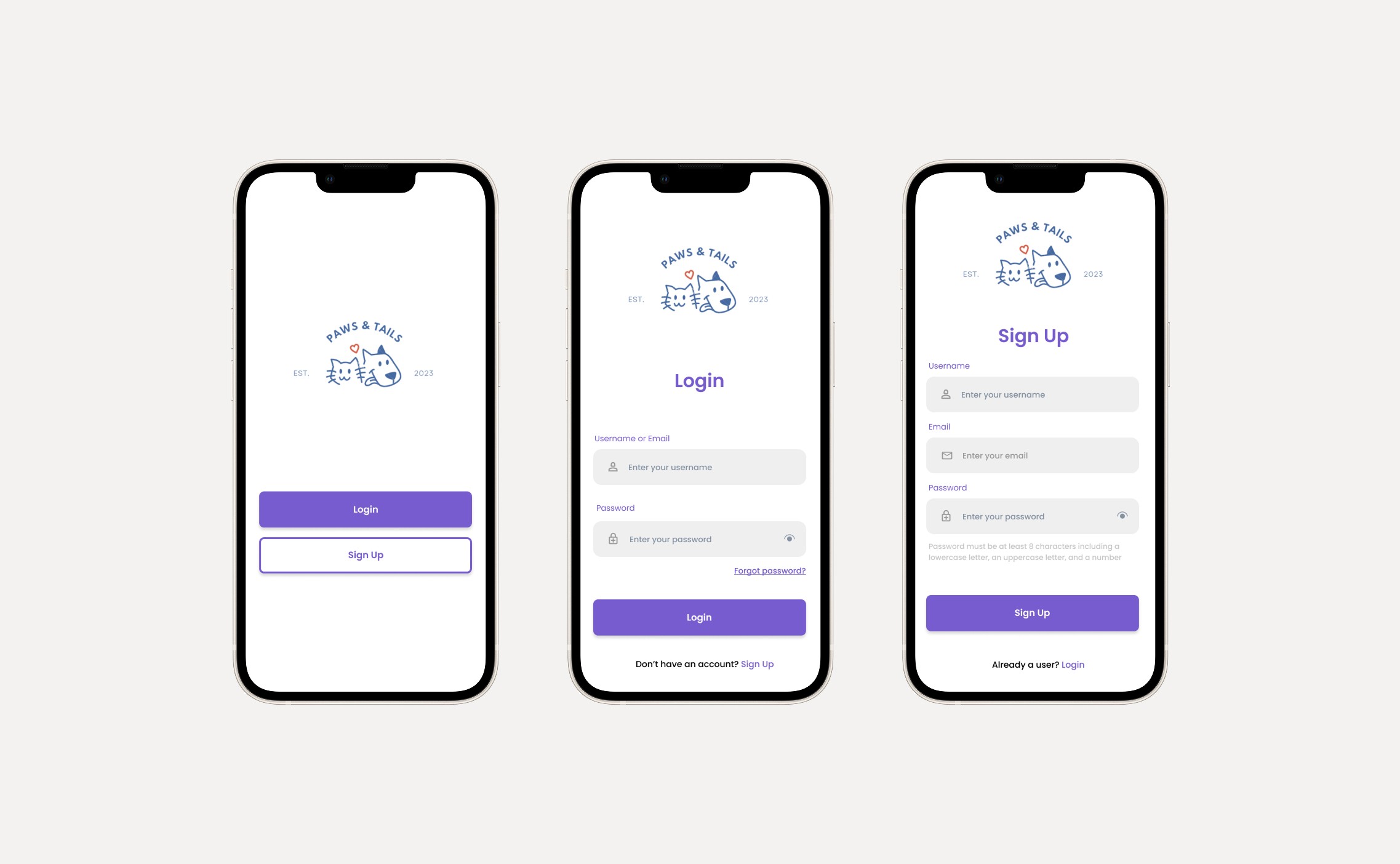
Onboarding
We developed a simple onboarding flow, streamlined to a welcome, login and sign up screen to ensure a clear and approachable entry point for new and returning users.
Navigation and home
The home screen and hamburger menu were designed to provide users with an intuitive navigation and quick access to key features.

Pet adoption journey
We designed a straightforward adoption process that mirrors online shopping to encourage users to engage comfortably and complete requests with confidence.

Shopping for pet supplies
The shopping experience was built to allow users to browse, select, and order pet products with ease.

Research
To guide us in the design process, we produced two archetypes which acts as the known target user groups for this app:


Design Process
Wireflow
We crafted a storyboard that acted as a wireflow to help us articulate how a user would move through the app to reach their goals. Here, we split it into two main flows: Pet Adoption and Marketplace.

Wireframing
Now that we have a better understanding of the user journey and the app as a whole, we began to design the structure of the app.

Hi-fi prototype
We consequently worked together to create a hi-fi prototype, which is the finalised design before it was presented before our classmates.

We conducted a usability test with target users to evaluate the app’s effectiveness, efficiency, and user satisfaction. The process involved:
Recruiting participants from diverse demographics.
Gaining consent and briefing them on the test's purpose.
Demonstrating the Paws & Tails prototype and addressing any questions.
Collecting feedback through a 5-point Likert scale survey post-demonstration.
Analysing responses to identify usability issues and improvement areas.
Survey questions focused on the following themes:
UI Policies: Behavior of interface elements (e.g., input validation, field visibility, default values).
UI Screens
UI Interactions
UI Components
Overall Experience
Key Findings
UI Policies
Users found the app easy to navigate and components were visually easy to recognise and recall although a small number of respondents remained neutral on the familiarity of icons used.
UI Screens
Users navigated through the application quickly and intuitively, accessing required information and features with ease.
UI Interactions
While most users received clear feedback when submitting adoption requests, placing orders, or logging out, some remained neutral about whether these actions were successful. Further investigation revealed unclear and redundant fields in the adoption and order forms, which caused confusion. Additionally, some users struggled to locate the logout button.
UI Components
Users easily viewed and interacted with various components, including headings, radio buttons, and checkboxes.
Overall Satisfaction
Users expressed extremely high satisfaction with the application overall, providing exclusively positive feedback.
Changing the design based on insights
While the hi-fi prototype shown in the previous section was the final design presented to the class, I took the liberty to refine the design based on the survey findings. I prioritised improving clarity and visibility in key features to streamline the user experience and support smoother task completion. These changes were then reflected in the updated prototype.


Takeaways
You don’t have to reinvent the wheel
UI/UX design thrives on familiarity. Reusing common UI patterns like the placement of a hamburger menu helps reduce cognitive load and promotes that sense of familiarity to users. This helped us see the design of the app in a user-centric way that feels natural to navigate.
Feedback goes a long way
The User Acceptance Testing offered crucial insights that validated our design decisions and highlighted areas for improvement. It helped us understand what worked, what didn’t, and where to iterate.
Teamwork makes the dream work
While task delegation could have been better structured (e.g., by design phase rather than screen ownership), working as a team was an enriching experience. We brainstormed a couple of ideas for an app to design and one of us actually recommended we do a pet adoption app (it was based on her final year project). It was something I never would have thought of at the time. Throughout the semester, we had each other’s backs and encouraged each other to improve.
Next Steps
Due to assignment constraints and limited time, there were aspects of the design process that could have been stronger. Here are two areas I believe would have significantly enhanced the project:
Incorporating user research
Although the app had a clear target audience (current and future pet owners), the lack of a user research phase made it difficult to fully understand their real needs. Early insights into user behaviour and pain points would have strengthened our design decisions.


